Before finalising my Design and Branding sheet I needed to decide upon a font style. I picked few that matched the grungy sci-fi/cyberpunk esque style.
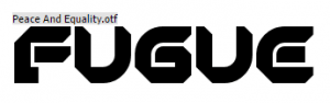
I liked how bold this font was as it stood out very quickly. However, the curves combined with the hard edges of some of the letters come across as a bit to cartoon like which doesn’t represent the grungy aspect of my brief.
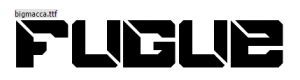
This Design is similar to the previous type font. However, as it has lines breaking segments of the letters up makes it look more interesting and unique. Whilst a font style like this might not be appropriate for my branding I can see myself using this font inside my interactive demo.
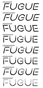
The variations of the font style above suit me well as I have a variety of option to choice from depending on where the title is being placed. The bottom few standout, particularly as they are broken into very thin line like you would inside an 80’s retro video game. This would be suitable for use within the video game menu seen within the interactive demo.
Conclusion
I am planning to use the last font style as part of my branding as it versatility gives me a lot of flexibility as an artist and creator. In addition to this as there are so many different styles that I have a lot of creative control over how I want my work to look.