First Person Camera

When it comes down to video games the players perspective can influence the way someone may play. Video games recently have tended to use three main points of perspective. These are the First person, Third person and side scrolling.

First Person

2871775-8293769087-24512

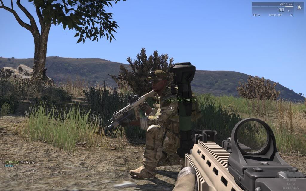
After researching into a couple of first person games. I have come to the conclusion that the perspective is often associated with shooters/action and horror games. The reasoning behind this as a player it immerses you into the narrative a lot easier than other games. In addition to this is simulates as if you are in the game itself. A trend that I have discovered is that first person perspectives are often combined with good to photo-real graphics as both these factors help to improve the player’s immersion by making you think you are the protagonist.

First person perspective is good if you want to create a immersive experience that makes the player feel as if they are actually there, compared to some of the other perspective’s I cover later.

Third Person

Witcher-3-2-840x473

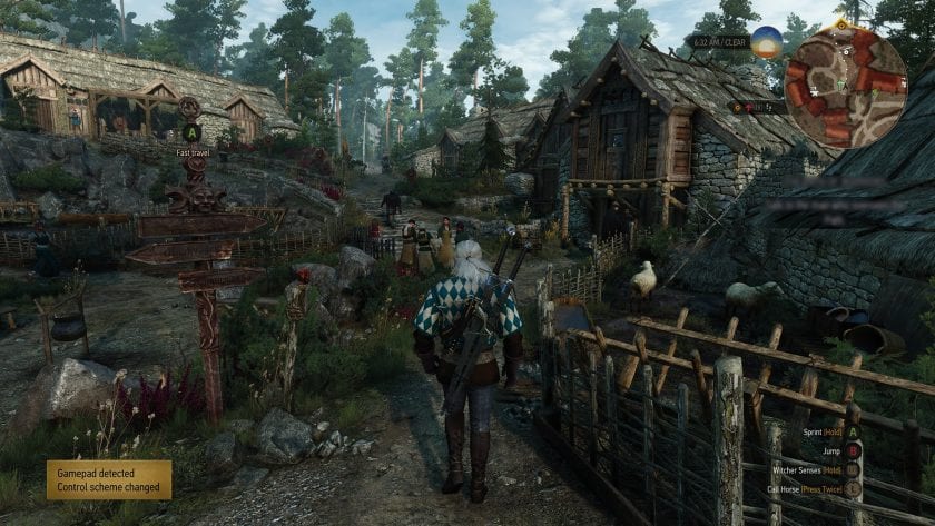
Personally I am a big fan of third person games as they are often combined with a lengthy story rich narrative and impressive sized open world. I often associate the third person perspective to be best suited for fantasy role playing games like the Witcher 3 and the Mass Effect series. The third person perspective imitates the role of a narrator recording the events of a protagonist. Whereas first person shooters have the impression that you are the in-game character,  Third person cameras whilst still giving the player full control of the protagonist are closer to a companion’s role. A good analogy is that it’s like someone reading a book, just that the book is virtual and interactive.

However for the brief I have been set a third person camera wouldn’t be appropriate as the space I am working around might clash with the camera set up required for third person games. Unlike first person perspectives which is able to do this.

Side-Scrolling game

Image15-2

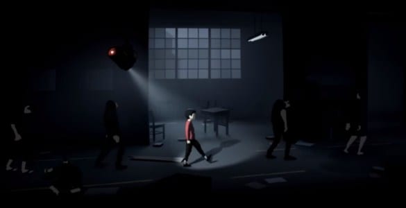
2D/2.5D games use a interesting camera which always stays on the protagonist of the game. Camera movements like this are good for story development and platformer games, but as the camera doesn’t move along the z axis it limits to what you can do with a games. Associated with side on cameras the games themselves often have heavily stylized graphics.

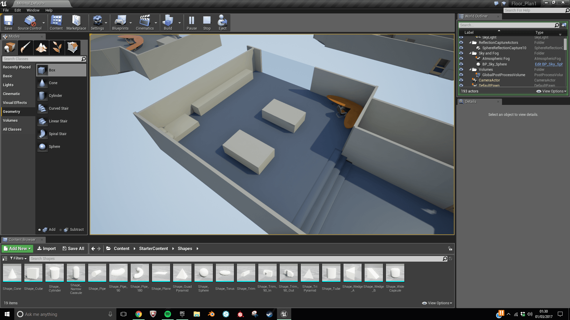
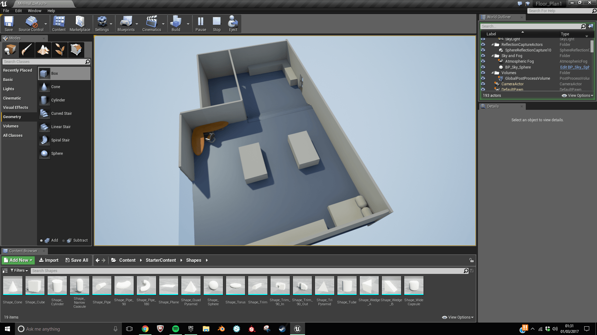
Side cameras whilst used in platform games work well the brief I have to follow is designed to be more of a interactive experience with the possibility of VR integration that can only be achieved using a first person camera.


SUMMARY:

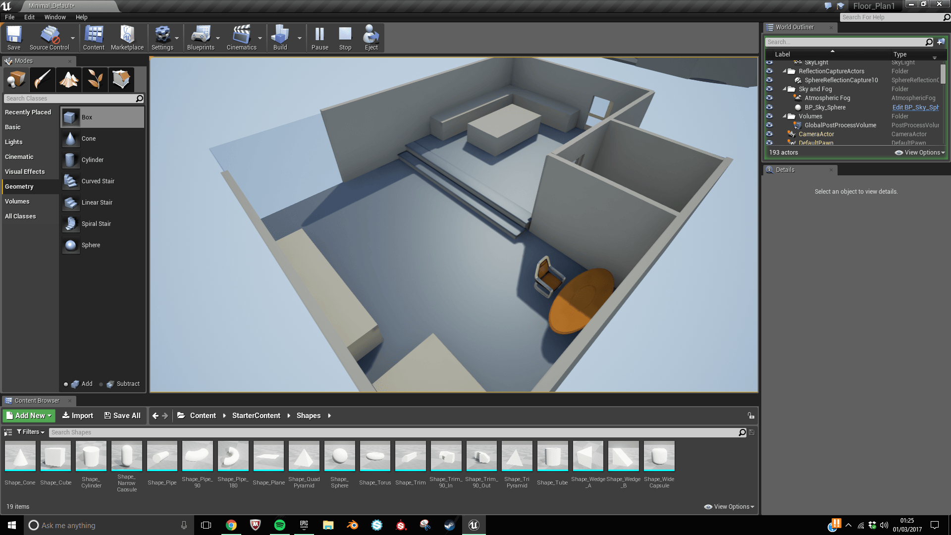
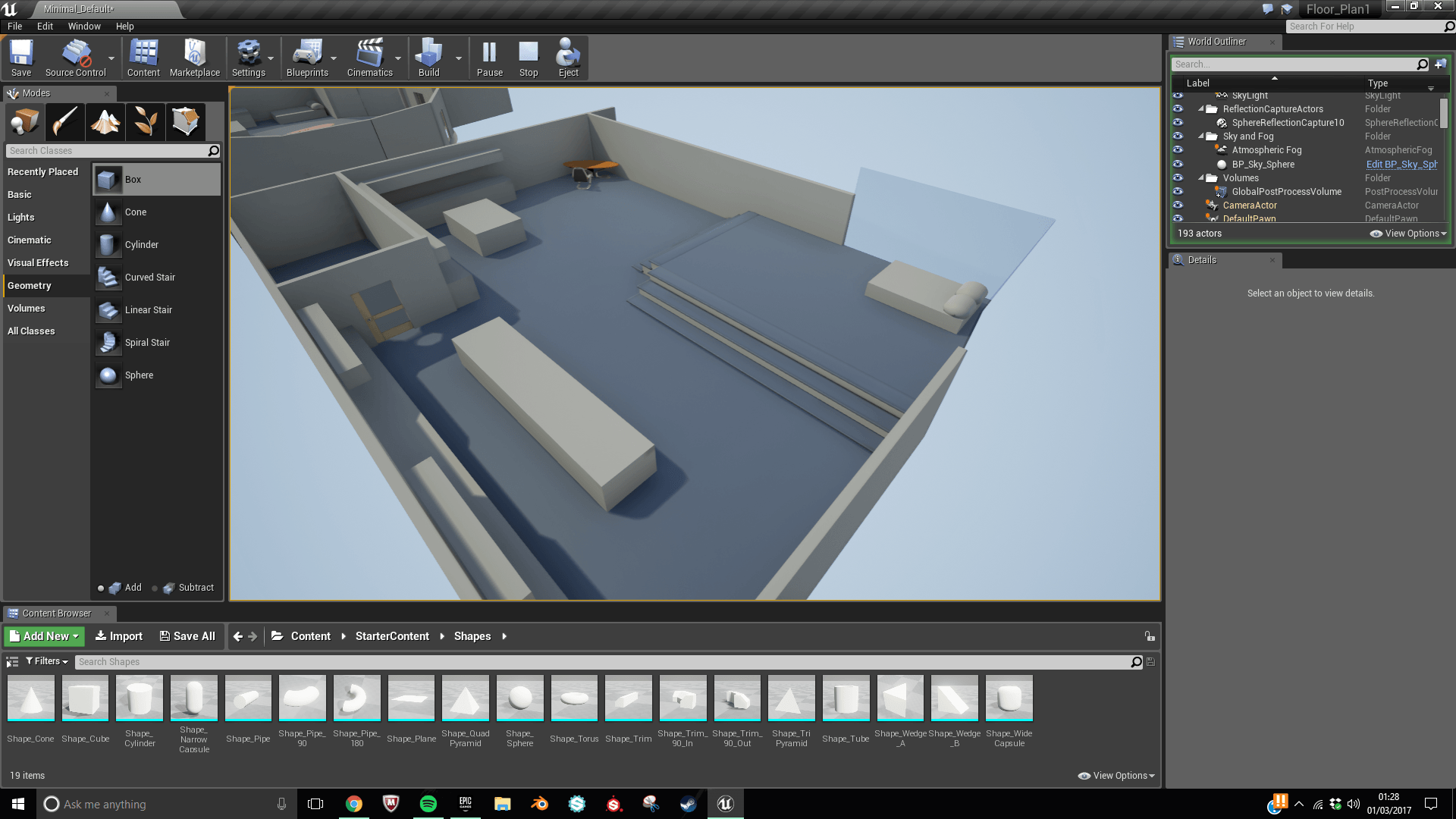
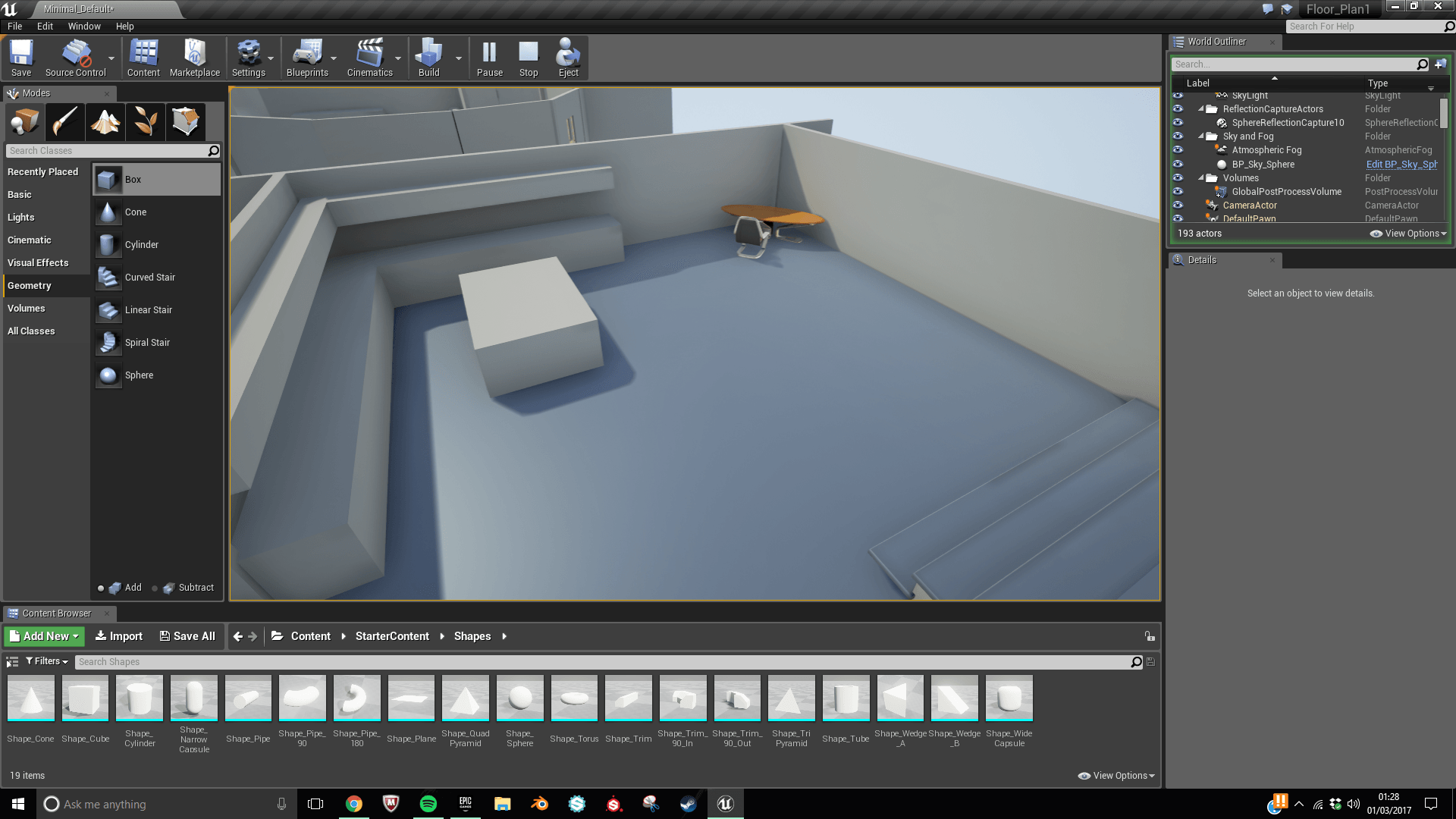
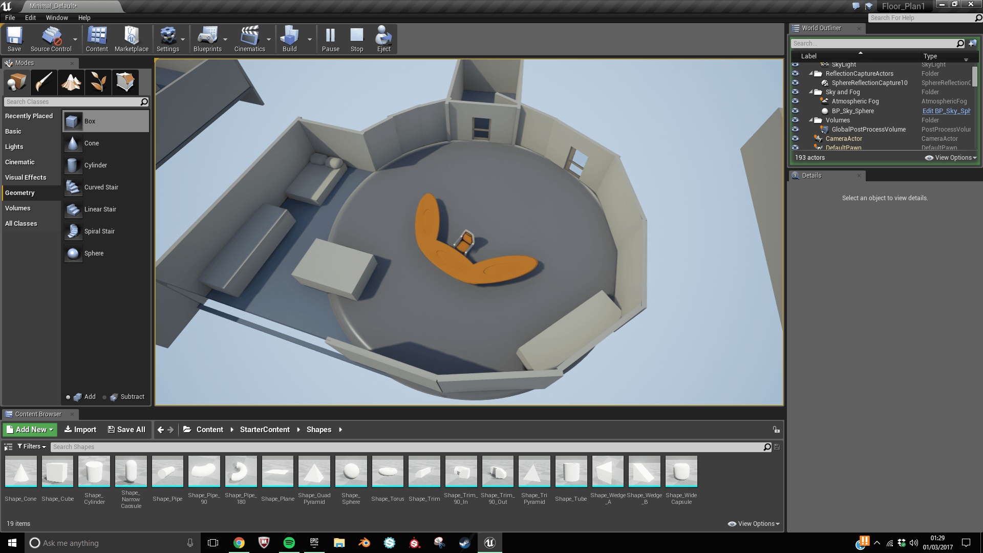
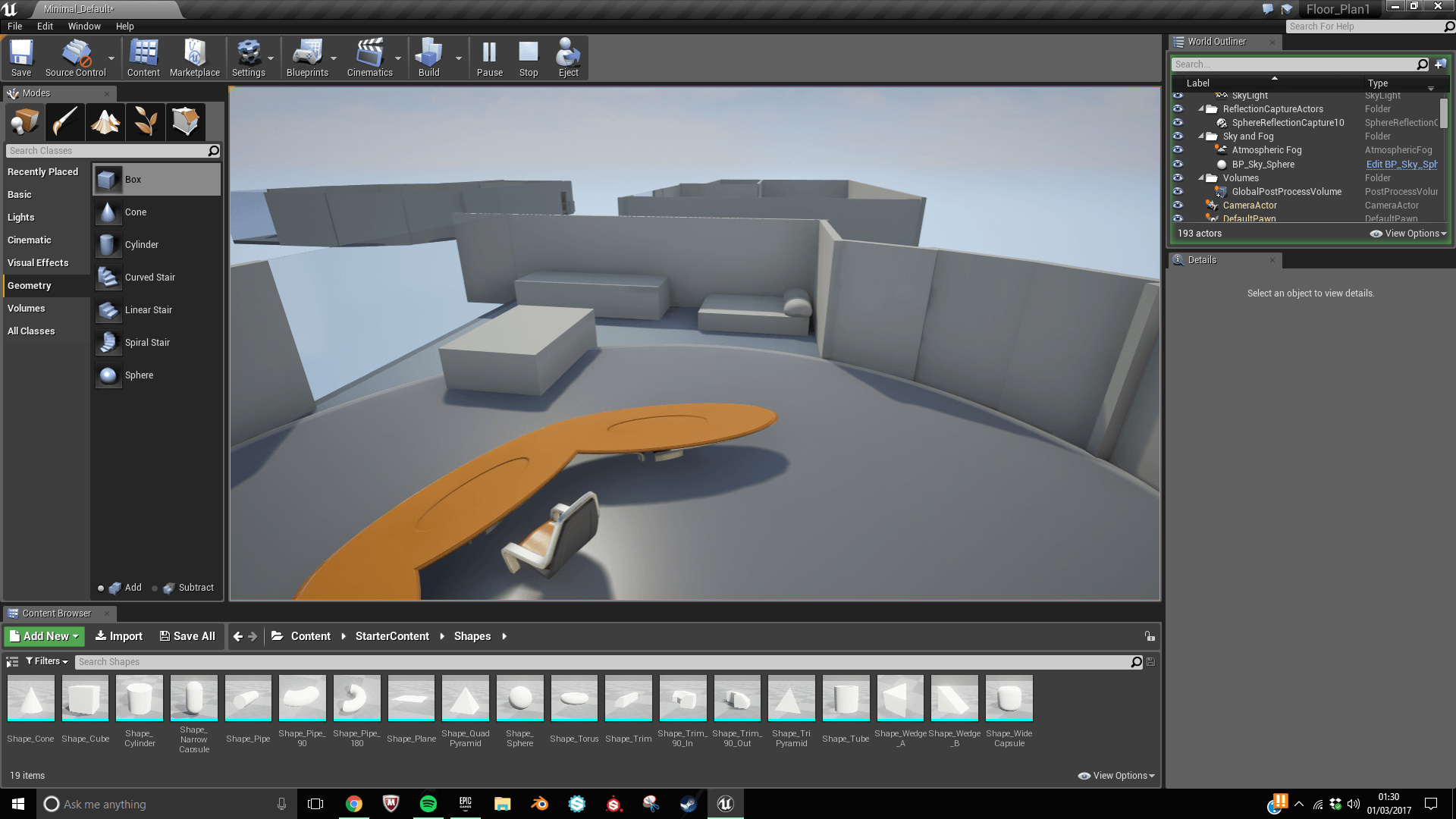
In conclusion I plan on using the First person perspective for the player as for what I am creating it will allow the player to be immersed in the interactive environment. In addition to this as I plan on creating a highly detailed room this can be experienced better in First person. Finally as mentioned earlier if possible I want to plan on exporting the finished project for Virtual Reality as well.

Blue Prints and Light Switch Interaction

What are blueprints?

Blue prints in unreal engine are a nodal based system giving creators near limitless creativity to what they are creating within the engine. Blueprints turns what might of been a 3D modelled and textured environment into something a player can interact with or cause a reaction to happen due to something a player might of done. As it is a nodal based system this equals a non destructive workflow, meaning that if something needs to be changed it can be without having to redo work. The game creator can just select the node that needs tweaking. These changes will then ripple down the workflow as it goes through other nodes until it reaches the end which is the final output.

The use of Blueprints means beginners can create complex games without the knowledge of coding. Which is often was discourages people from the video game industry.

Light Switch and making it an interactive object

I decided as part of my research into how blueprints worked I thought that I could model a light switch for my apartment and use the blueprint system to cause lights to switch on and off. The result of this will turn what was more of a 3D photograph in a video game.


Interaction Work-flow

1

First Step was to model the light switch in Blender. I did this by transforming a cube into the shape I required.


2

I then went on to add other shapes into the mesh itself. I added extra cubes for the buttons and a sphere which makes up the houses Ai ‘eye’. I took inspiration from Stanley Kubrick 2001: A space Odyssey. As the Hal, the Ai featured a red sphere as an eye.


3

I made sure that all the rotation and scale had been applied ready for Uv Unwrapping


4

I went on to creating a colour Id map to make my process a bit easier when it came to texturing in substance.


5

I textured in substance to create the desired finish for the light box. I deliberately left a space at the top so that I can add video textures, ready for when I import it into unreal engine later on.  I combined various materials that had various specular properties such as the matte paint and red glass.


6

I began by joining all of the separate meshes and joining them together an object called a ‘bone’ and pairing it with the button. This was achieved through weight painting. I was able to accurately choose how to select which faces are affected by the bone by selecting the required vertices.


78

I began to animate by placing a keyframe and them moving along the time line and then transforming the object to the required position and placing another keyframe. I repeat this process once again until I have the required animation sequence.


10

When exporting the first time I hadn’t joined the mesh together so when it came to the exporting I encounter the problem that not all of the model exported into unreal and in addition to this the animations didn’t correctly link together. I then realised that this was due to the full model being made up of separate meshes.


11

I managed to import the model into Unreal engine after fixing the issue of multiple meshes.


12

I was following a video tutorial showing how to properly set up a blueprint that triggers and animation alongside a reaction. In this case, it is a light switch being linked to an action.


13

I followed a tutorial which showed how to create the blueprint to toggle the light, once this was done I made sure to compile the blueprint to enable it to work.


14

I scaled the model down to a more reasonable size so that it would be more proportional to the other objects and first person viewpoint.


After a while of attempting to get the animation to import incorrectly, I kept having the same issue with my model which was that the animation wasn’t importing correctly. After a considerable amount of unsuccessful attempts and watching various different tutorials on the internet. I decided that I would come back to it I had time later on and that I would leave it for now and move one with other parts of my project.


Design Sheet

When I was putting every together I made myself a design sheet so if I was ever going off track I am able to revert back to this, whilst this is still a very basic sheet, I plan to build upon as my project develops so that my branding can mirror these new additions.

Deisgn Sheet

The stripes of colour in the background represent the colour palette I plan on using In my work and branding. The images represent the sort of symbols I want to try and capture in my work.  Whilst the two font styles will be used for heading and the font used to promote the interactive character biography. As my work is still in its early phases of development this design sheet could change as my project develops.


Font styles

Before finalising my Design and Branding sheet I needed to decide upon a font style. I picked few that matched the grungy sci-fi/cyberpunk esque style.

2


I liked how bold this font was as it stood out very quickly. However, the curves combined with the hard edges of some of the letters come across as a bit to cartoon like which doesn’t represent the grungy aspect of my brief.

4

This Design is similar to the previous type font. However, as it has lines breaking segments of the letters up makes it look more interesting and unique. Whilst a font style like this might not be appropriate for my branding I can see myself using this font inside my interactive demo.


3

The variations of the font style above suit me well as I have a variety of option to choice from depending on where the title is being placed. The bottom few standout, particularly as they are broken into very thin line like you would inside an 80’s retro video game. This would be suitable for use within the video game menu seen within the interactive demo.


Conclusion

I am planning to use the last font style as part of my branding as it versatility gives me a lot of flexibility as an artist and creator. In addition to this as there are so many different styles that  I have a lot of creative control over how I want my work to look.


Floor Plan Ideas

Before I began construction of the rooms. I made sure that I had explored other shapes of rooms to see which worked best.

I sketched up a few designs that I could try out:

17036213_10202717066485915_14556558_o

For the reconstructions below I plan on using the starter content as it will help save time in the long run as themes are just 3D visualisations. Below are a couple photos of floor plans that have just enough detail to make out the layout of each area without going into so much detail various areas whilst still not going into to much detail.

1

8 9

This first Design is a very simple layout with minimal rooms. That feature around a central table. This design could offer opportunities to go into a lot of depth as it isn’t a large space. I like the idea of having a corner desk as once it has been joined with all the extra assets it will be an area that people are drawn to.

2

10 11

Layout 2 appeals to me as it has two layers which give it a more dynamic and modern feeling. This layout also makes use of the corner window giving it a large space to look out the window. I plan on using the 2 levelled approach in my final design as I feel that it will make my project more visually appealing.

3

12 13

This design was a very experimental design as the main room is essentially a circle with the exception of the window and the kitchen area. I wasn’t a massive fan of this design but when I was sketching it up a didn’t want to draw up any conclusions until I had considered all my options.

4

14 15 16

This is my favourite design as it feels like it has the most going on with it. Whilst it is a lot bigger so it will require a considerable amount more work to make a space like that filled with detail. There are aspects of this design that I like. such as the table top and overhead shelving unit travelling along two walls. By doing this is will fill up a lot of space whilst adding lots of detail.

5

17 18

6

19 20

This design whilst being similar to design 2 has a lot of difference from the other mockups. It features on long window along one of the walls with the living, working and sleeping all in the same room. I do feel that this design doesn’t use space it is given to the best it could though. The two table objects in the centre could be repositioned to make more a central space.