Before I began construction of the rooms. I made sure that I had explored other shapes of rooms to see which worked best.
I sketched up a few designs that I could try out:
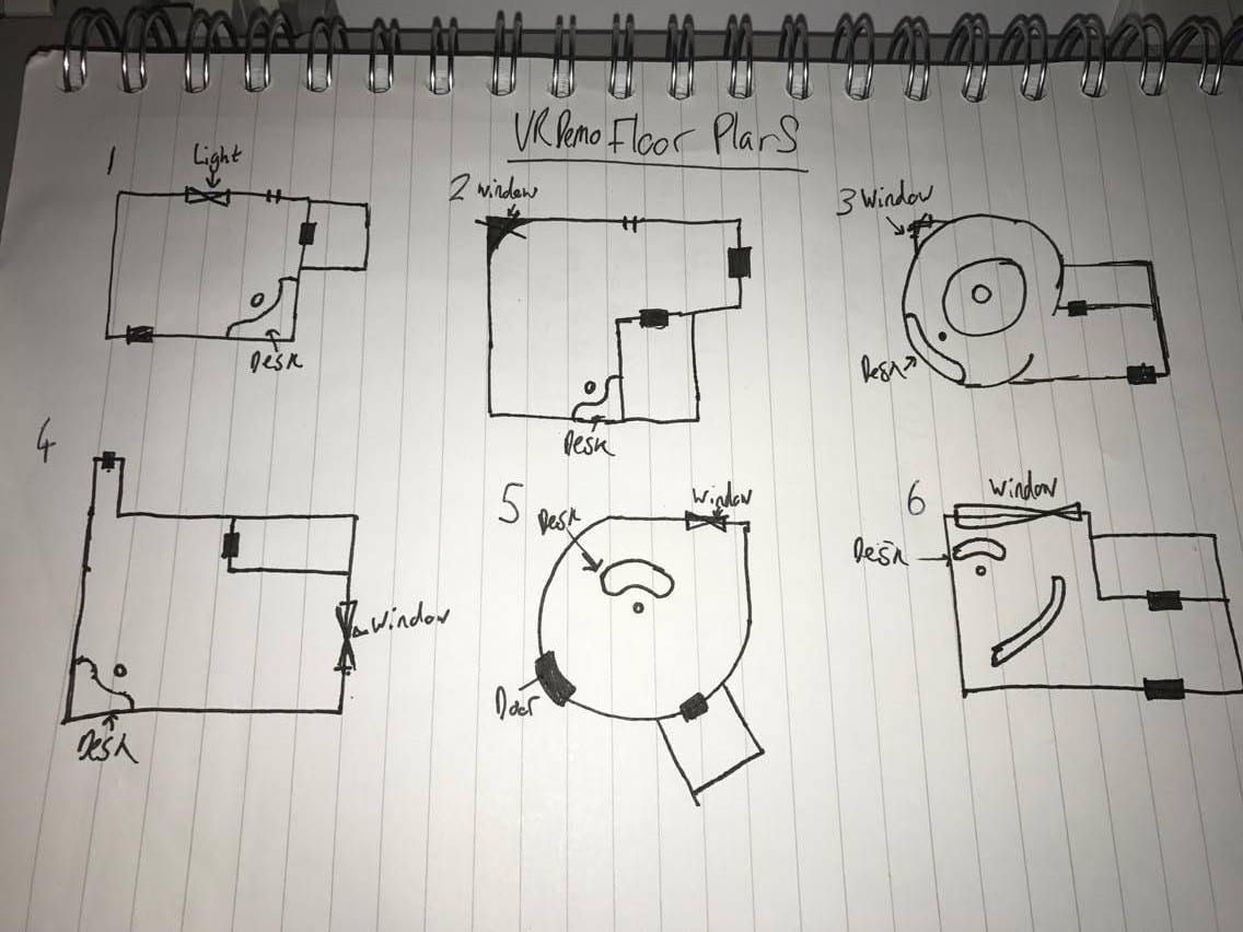
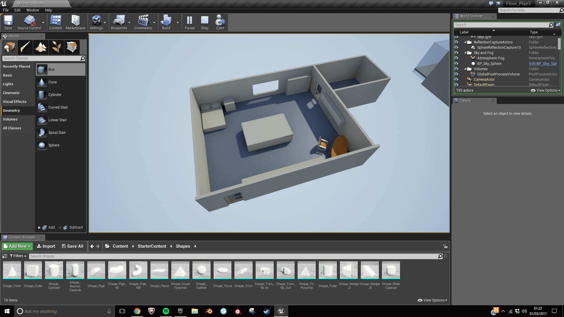
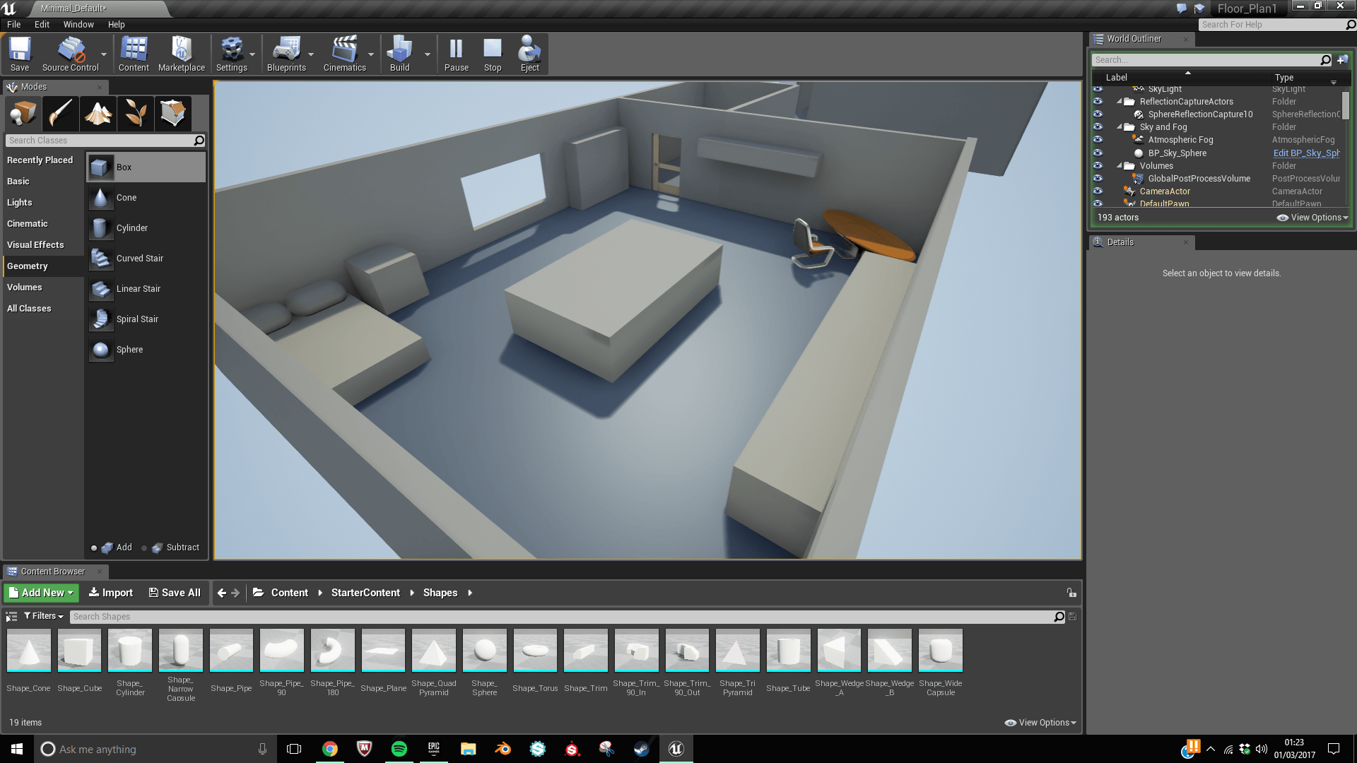
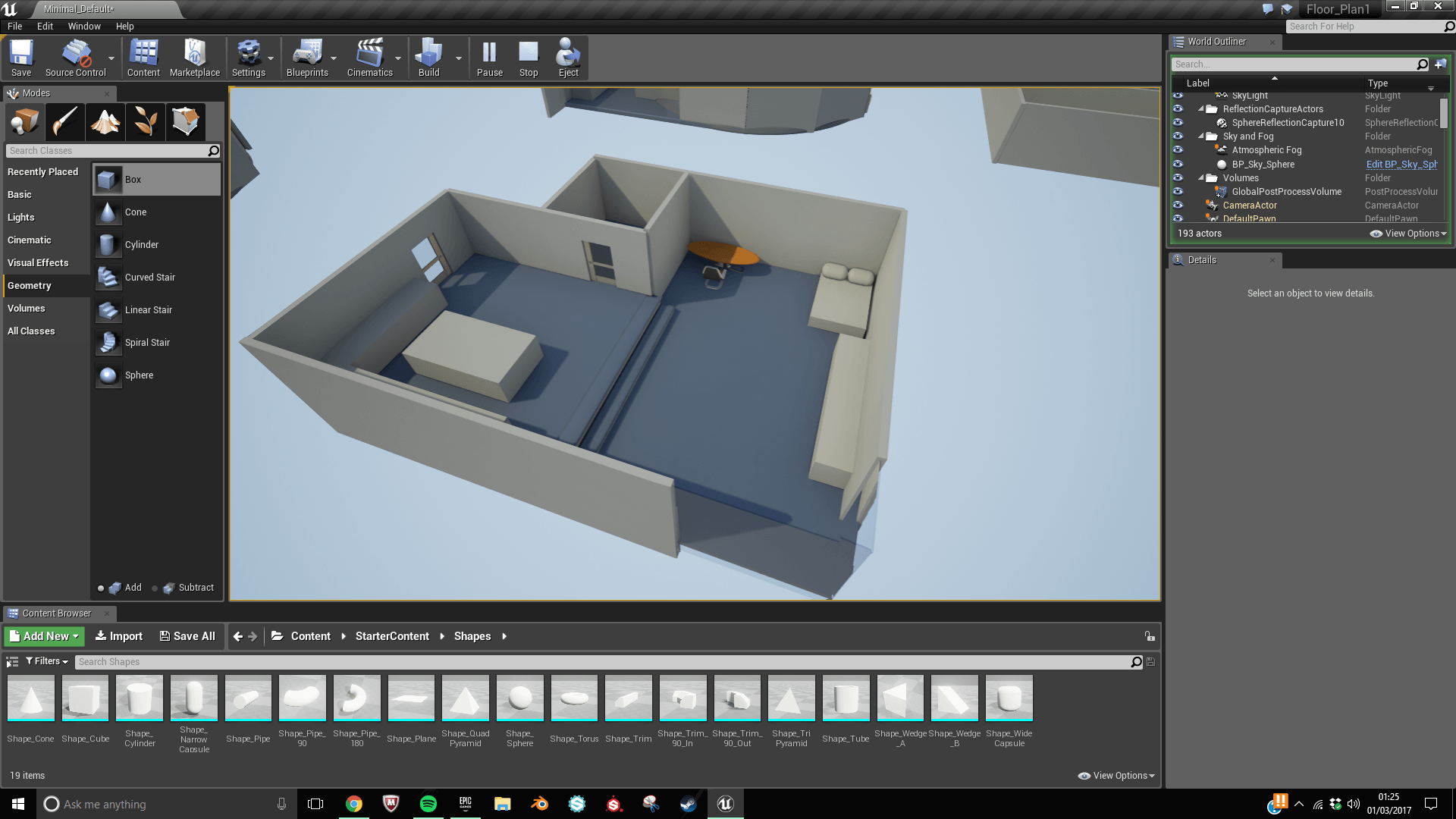
For the reconstructions below I plan on using the starter content as it will help save time in the long run as themes are just 3D visualisations. Below are a couple photos of floor plans that have just enough detail to make out the layout of each area without going into so much detail various areas whilst still not going into to much detail.
1
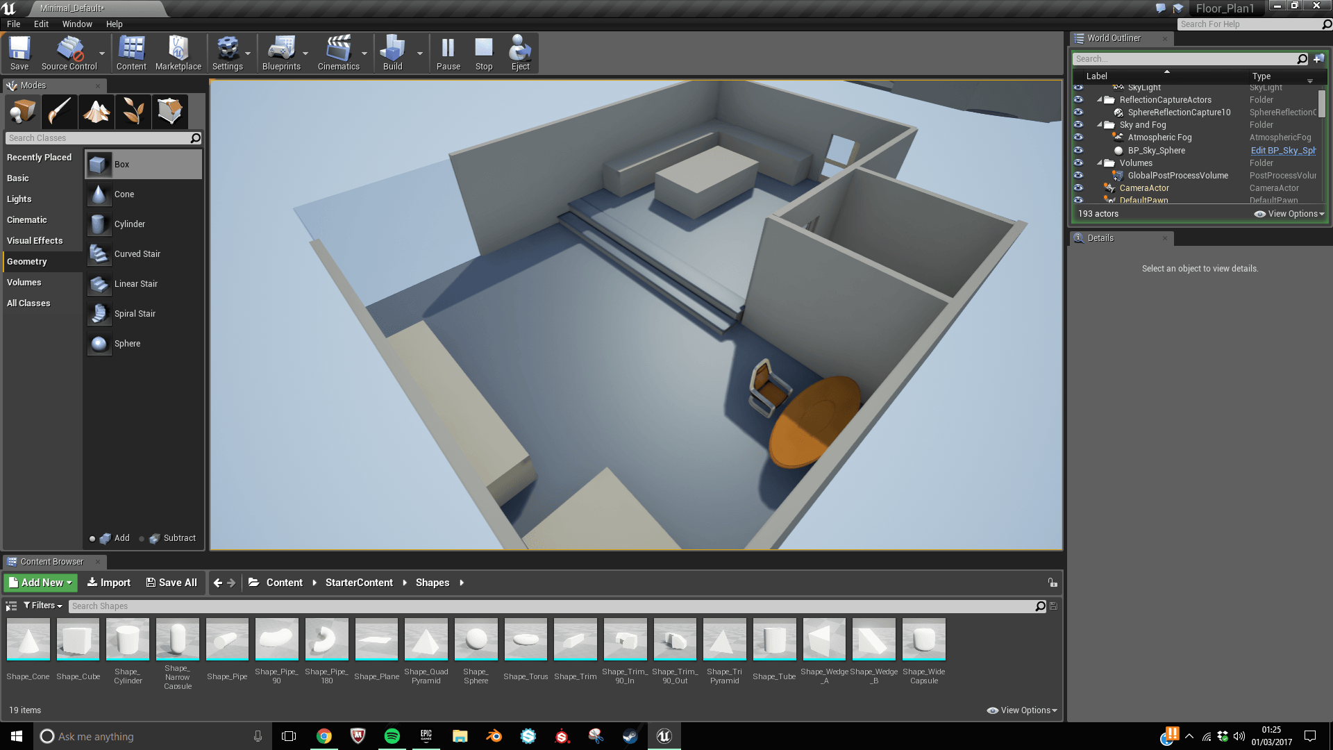
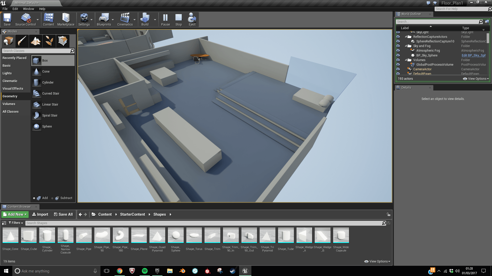
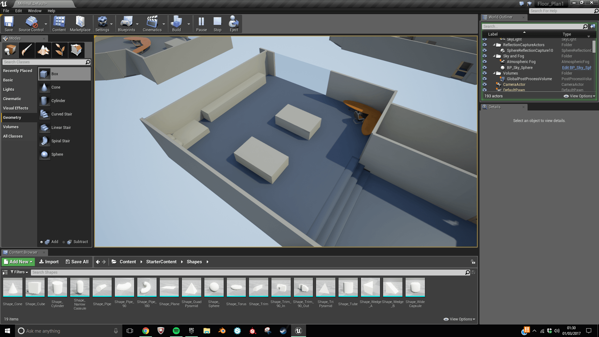
This first Design is a very simple layout with minimal rooms. That feature around a central table. This design could offer opportunities to go into a lot of depth as it isn’t a large space. I like the idea of having a corner desk as once it has been joined with all the extra assets it will be an area that people are drawn to.
2
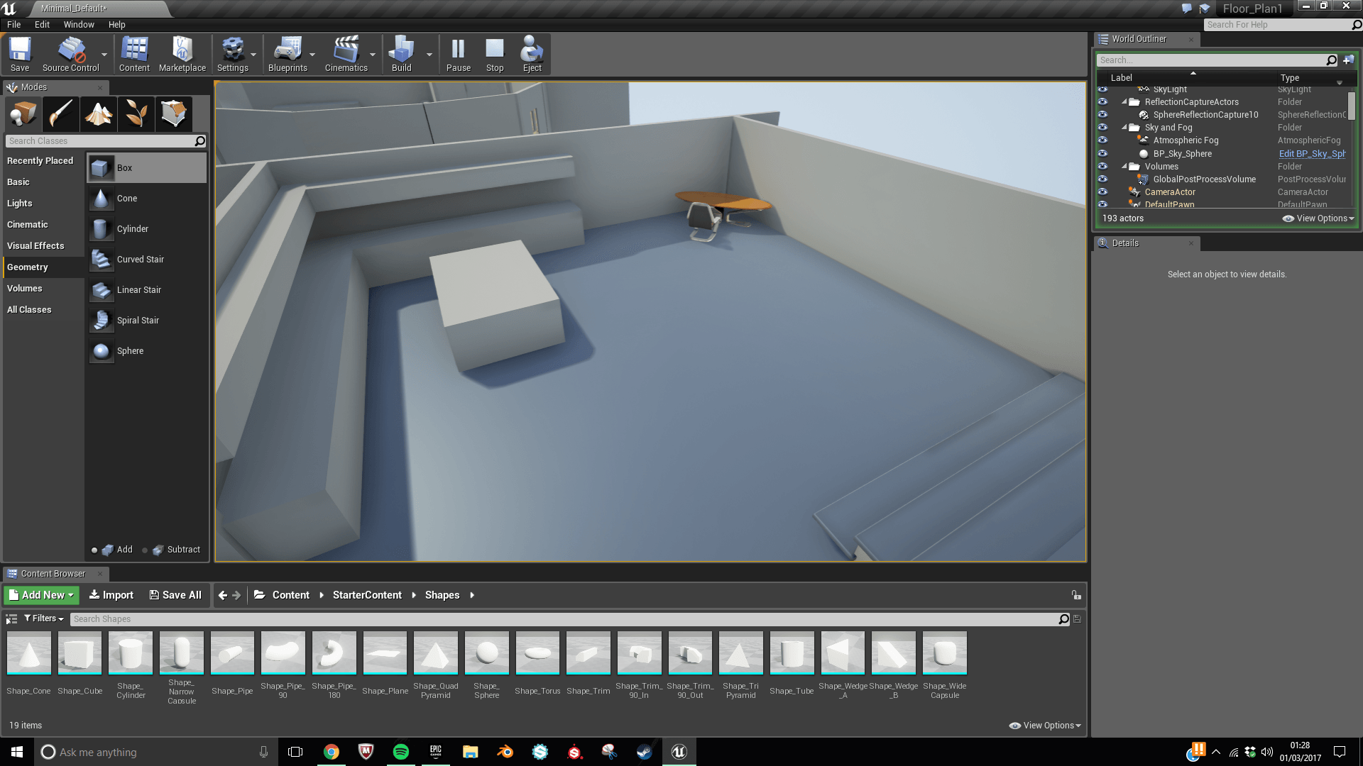
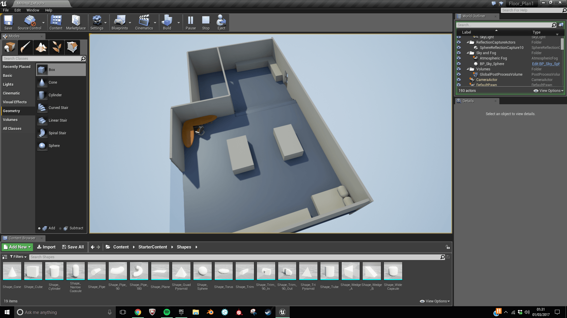
Layout 2 appeals to me as it has two layers which give it a more dynamic and modern feeling. This layout also makes use of the corner window giving it a large space to look out the window. I plan on using the 2 levelled approach in my final design as I feel that it will make my project more visually appealing.
3
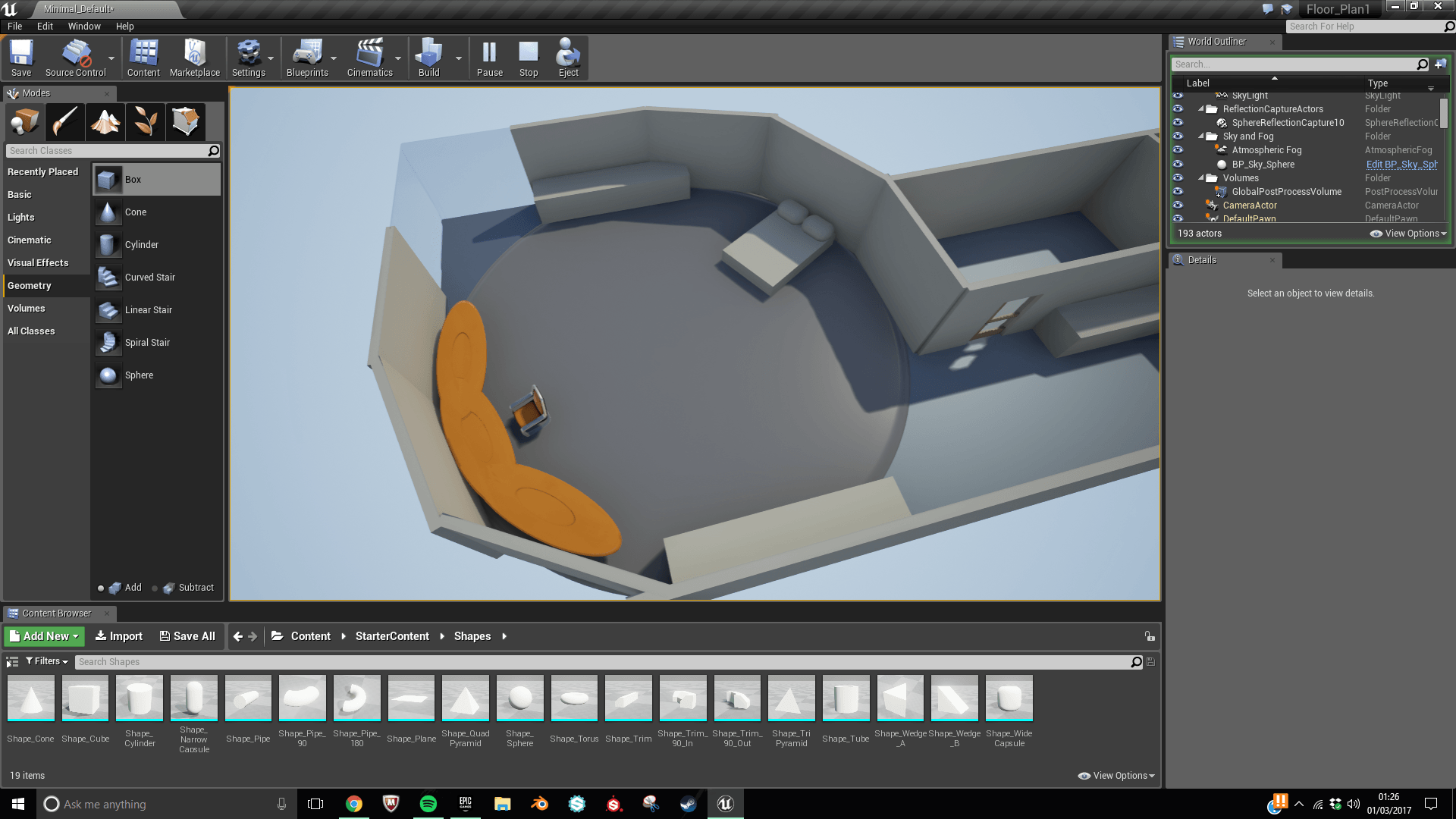
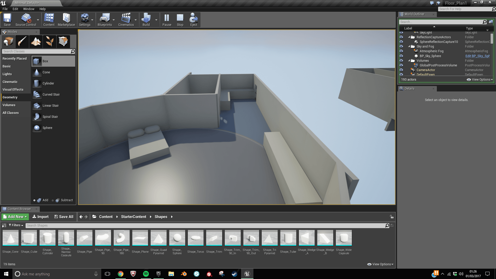
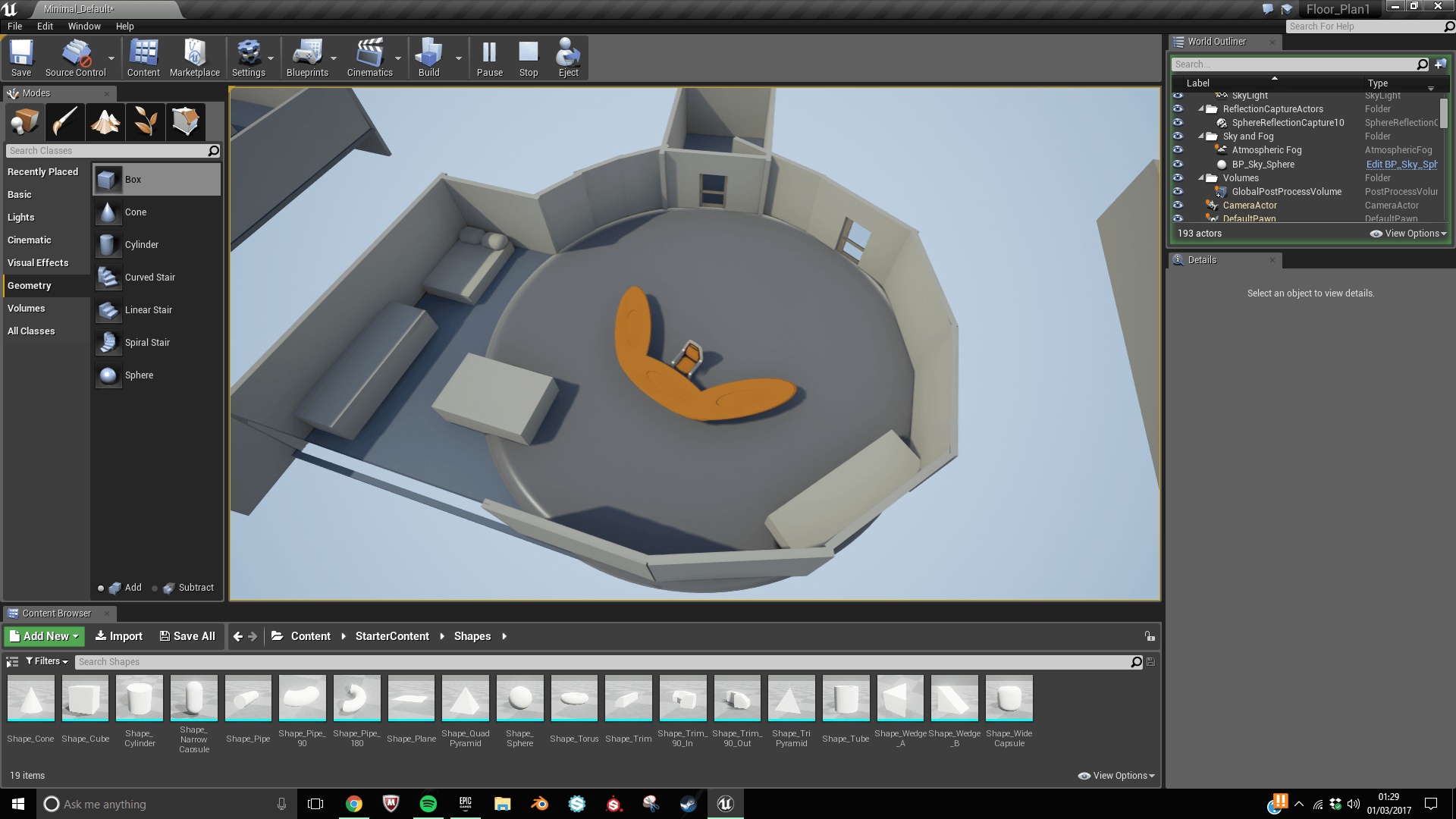
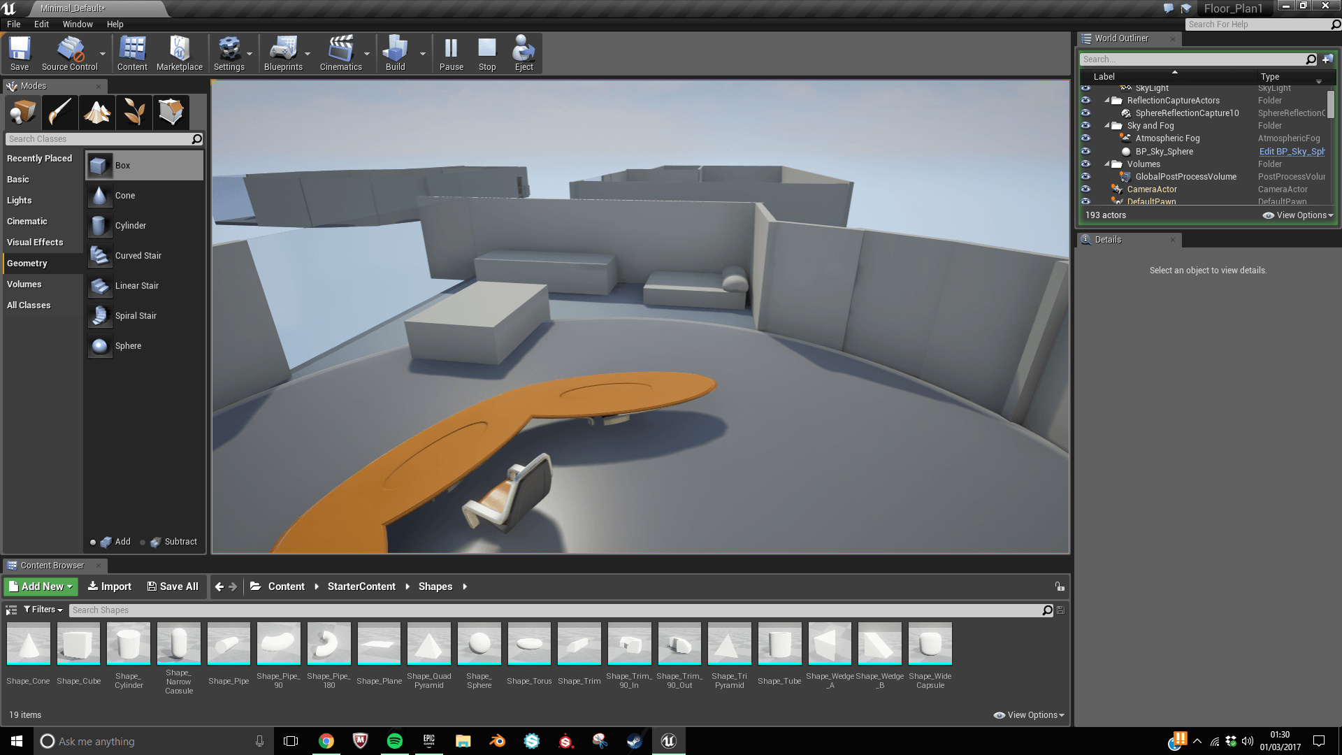
This design was a very experimental design as the main room is essentially a circle with the exception of the window and the kitchen area. I wasn’t a massive fan of this design but when I was sketching it up a didn’t want to draw up any conclusions until I had considered all my options.
4
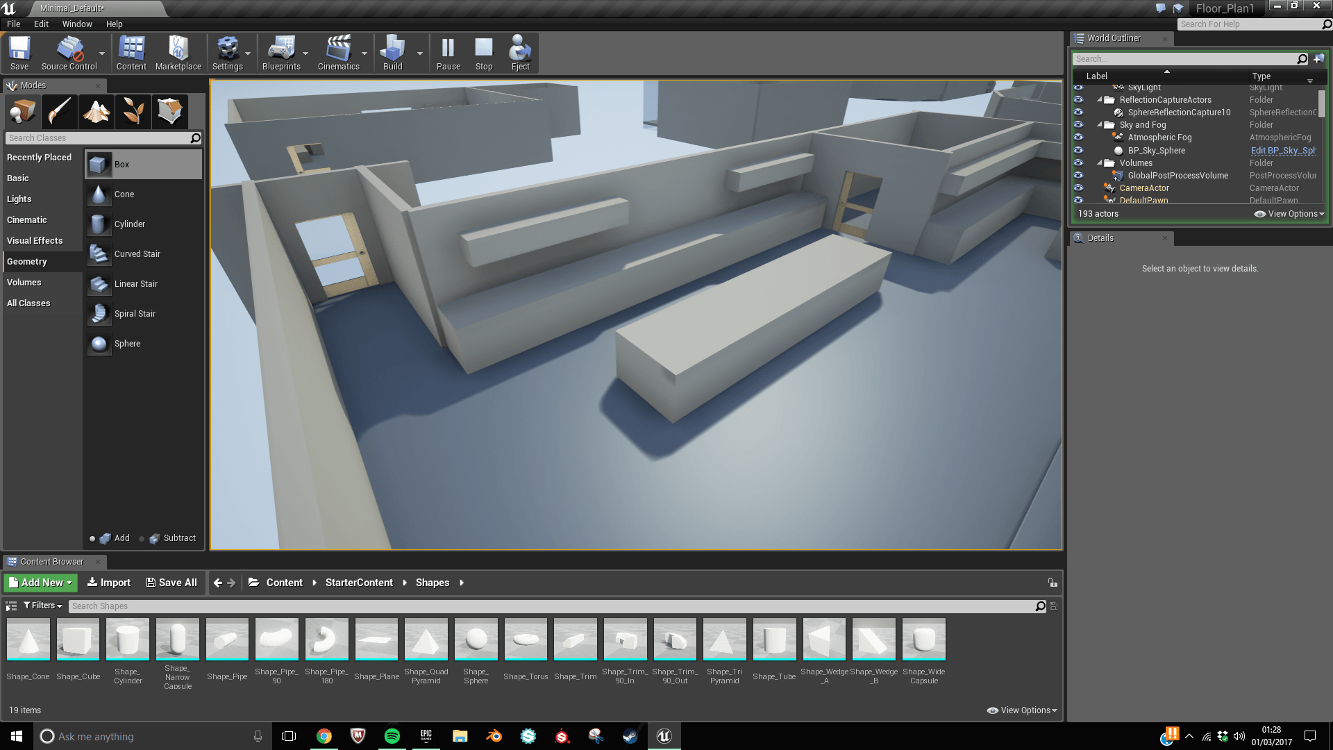
This is my favourite design as it feels like it has the most going on with it. Whilst it is a lot bigger so it will require a considerable amount more work to make a space like that filled with detail. There are aspects of this design that I like. such as the table top and overhead shelving unit travelling along two walls. By doing this is will fill up a lot of space whilst adding lots of detail.
5
6
This design whilst being similar to design 2 has a lot of difference from the other mockups. It features on long window along one of the walls with the living, working and sleeping all in the same room. I do feel that this design doesn’t use space it is given to the best it could though. The two table objects in the centre could be repositioned to make more a central space.